


Responsive Testing
Websites that use responsive testing alter themselves to fit different screen sizes in a way that does not compromise usability or user experience. The size of the text, UI elements, and images is adjusted accordingly. HTML, CSS, and JavaScript code can be written once for multiple devices, platforms, and browsers thanks to responsive testing.
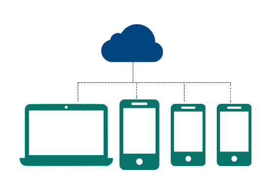
Don’t Repeat Yourself (DRY) is the development philosophy that encourages the development of responsive testing that are device-agnostic. It's more complicated than that. The process of making an existing site responsive can be challenging, but the benefits far outweigh the effort involved in getting it right from the start.
What We do
Live Testing
This form of testing is useful for showing clients what is happening during the development process. It involves simply placing your work in a temporary online location and restricting access to it. In this way, clients can check-in, gauge how things are going, and give feedback without bothering the developer too much. When an application is being built, it can be beneficial for the developer to have several versions up and running simultaneously, and accessible everywhere. An online test environment with a good CMS makes projects very accessible and organized from anywhere, so developers do not feel like they are working in a vacuum.
Visual Testing
The objective of visual testing is to determine whether the application produces visible results that match those expected by design. This means it catches "visual bugs" in the appearance of a page or screen, which are completely different from strictly functional problems. Any application that features a visual user interface is capable of running visual tests at any time. Most developers run end-to-end testing on a functioning application during development, as well as individual components during development.
Screenshot Testing
Testers render UI components using pre-computed or static data and take screenshots of them individually to test their visual functionality. A previously captured reference screenshot (made using the same preconditions) is compared with this screenshot. A change is deemed invalid if the results have changed. Using Screenshot Testing, tests such as these do not have to be as painful as they are now. Although this technique will not resolve all of our testing problems, it will simplify a few of them.
Cross Browser Testing
When you do cross-browser testing for your website you can check whether or not it works when viewed on a wide range of browsers and operating systems, e.g., on Firefox, Chrome, Edge, Safari - on any of the popular platforms including Windows, macOS, iOS, and Android. The website can be accessed and interacted with on a variety of devices, such as smartphones, tablets, desktop computers, and laptops. The website is compatible with assistive technologies for persons with disabilities, such as screen readers. The goal is to deliver releases that are browser-agnostic, which allow for consistent user experiences on a range of browsers/devices that is ever-growing and diverse.
Browser Stack Testing
BrowserStack is a testing platform that allows websites and mobile applications to be tested. The platform is cloud-based. The tool can be used by developers and testers of web and mobile applications to perform cross-browser tests in various web browsers. Without virtual machines, devices, and emulators, we can test a web application in multiple browsers and mobile applications on all mobile platforms. Testing mobile applications for Android and iOS is possible.
LOOKING FOR A RELIABLE PARTNER FOR YOUR NEXT PROJECT?
Advantages of responsive testing
We focus on skill and methodology in E2logy's responsive testing services. We conduct regular sensitive testing by our software quality experts to ensure that our customers are satisfied with the results.
Stay ahead of the competition
For your website to stand out from your competitors, it needs to be responsive. You should have one website that is compatible with all mobile devices. It will provide the most appropriate layout and content for each device based on the layout and content of the responsive website.
Effortless and timesaving
When online businesses had two versions of the same web site, it was quite common. Desktop users had one, mobile users had another. Maintaining two websites simultaneously is very troublesome and time-consuming. An adaptive web site is compatible with all devices - desktops, laptops, mobile phones, and tablets alike.
Enhances reach
It has become increasingly important to target mobile users as time progressed and the importance of mobile users increases. The number of mobile users is increasing each day, and with responsive websites, the online experience is becoming more interactive.
Boosts SEO & online marketing
Search engine optimization performed properly on responsive websites can increase their search engine ranking. As mobile-friendly websites offer a better user experience than those that cannot be viewed on mobile phones, their rankings will improve. A mobile-friendly website has a responsive design that corresponds to the size of the device.
Boosts online business
Mobile devices make it effortless to switch between shopping carts. Websites for mobile devices make it easier to view products and services. Increasingly, users browse the Internet all day long on mobile phones, and shopping has become a passion. Then your users will not come back again if you cannot provide them with a good mobile experience.
More social media users
Most social media consumption occurs via mobile devices, and social media users are increasing every day. If you share several links on Facebook, YouTube, Twitter, and Pinterest, you will gain many users and traffic. It is also important that your website is responsive to effectively implement social marketing campaigns.
WE WORK WITH

SMEs
Engaged both small and medium enterprises (SMEs). As a leading IT company in this digital age, we make small, medium and large companies improve the way they do business with their clients, vendors, employees, and partners.

AGENCIES
Providing services to consulting companies, independent software vendors (ISVs), companies developing software products, or agencies. Providing end-to-end services or serving as an extended team, we partner with agencies to build their clients' projects.

STARTUPS
Experience working with more than 100+ global tech startups for their web, cloud, mobile, IoT, and blockchain needs. No matter what stage you are in - Seed, Expansion, or even in the pre-seed phase - we empower and support startups with our digital expertise and experience.
SMEs
Engaged both small and medium enterprises (SMEs). As a leading IT company in this digital age, we make small, medium and large companies improve the way they do business with their clients, vendors, employees, and partners.
AGENCIES
Providing services to consulting companies, independent software vendors (ISVs), companies developing software products, or agencies. Providing end-to-end services or serving as an extended team, we partner with agencies to build their clients' projects.
STARTUPS
Experience working with more than 100+ global tech startups for their web, cloud, mobile, IoT, and blockchain needs. No matter what stage you are in - Seed, Expansion, or even in the pre-seed phase - we empower and support startups with our digital expertise and experience.