


Designing High Converting Website Pop Ups That Entice Visitors
- Share on:
-

-

Ever came across a pop up that is so loud and aggressive that you literally felt it being thrown in your face? Ofcourse, you would have come across many. How do you feel when you come across such pop ups? Obviously not good, do you? Irrespective of whether it is an entry pop-up or an exit one, it will tend to offend and annoy the crap out of users, which will ultimately make them hate your website.
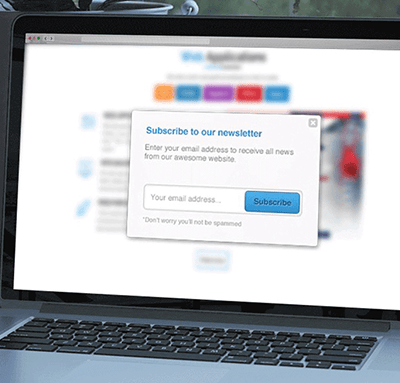
Designing a pop up isn’t rocket science. But, it definitely is an art and ignoring the important aspects & considerations while doing so could surely prove to be a blunder.
Here are some examples of pop ups done right:
- Quick Sprout, the business and marketing blog of Neil Patel
- Mashable, a leading media source for digital innovation and online trends uses unique pop ups based on traffic source with tailored messaging. Also, it shows social proof of the site and has a clean design with lots of white space.
- Mountain Standard uses clean and consistent looking pop ups with clear branding, beautiful photography, and a clear laid our incentive for the visitors.
- Shinesty, an e-commerce store uses a clever headline which has a touch of humour and engages the visitors well. It uses fun and relevant imagery as well as a clear incentive with strong CTA.
- Grub Hub, the online food ordering company uses great personality-infused pop-ups with clean and crisp design that have lots of white space and a clearly noticeable headline.
- Cosmopolitan, the international fashion magazine for women, through its pop ups, offers its visitors something they just want in return for their email addresses, including digital products, secret hacks, etc.
- Fed by Threads has a stark black and white pop up that draws attention to its offer in an excellent way. It has an uncluttered design which makes visitors immediately notice the benefit they’ll get by subscribing to them.
Here are some features that make a pop-up look outstanding:
- A clever, actionable headline with a crisp welcome message tends to grab the attention of visitors well.
- Simple and clear copy tells visitors what value will be received and thus, encourages them to take an immediate action.
- One of the most important features of an outstanding pop up is how well it conveys its benefits to its visitors. Have a strong CTA.
- Beautiful photography that is also relevant and aligned with brand is another feature that make a pop-up effective.
- Pop up color should match the website’s design. Understand the psychology behind colors before choosing them for your pop up and use color combinations that compel users to take action.
- Use unique fonts to draw the attention of visitors but make sure, you do not go overboard with your fonts.
Types or categories of popups
Pop-ups are divided in various categories or types according to how and when they are presented to visitors. One should be thoughtful enough as to what kind of pop-up to use on the website.
- Welcome pop ups: These are presented immediately when a visitor arrives at a website. Though they can grab the attention of the users well, they cannot be used on all kinds of websites. You should only consider using this type if you’ve got a sale going in your online store, or some awesome deals/contents, etc, happening on your website.
- Exit intent: This type of pop-up is shown to visitors when they move their cursors to leave the page and offers a deal that’s difficult to refuse.
- Behaviour-driven: This kind f pop-up is shown when a visitor performs a certain behavior that’s indicative of something, for example, scrolling.
- Time-driven: These kind of pop-ups are presented after the visitor has spent a certain amount of time on your site. The logic here is that once the visitor has spend enough time on your site, it would mean that they’re interested in your site and thus, you present the pop-up to offer him more.